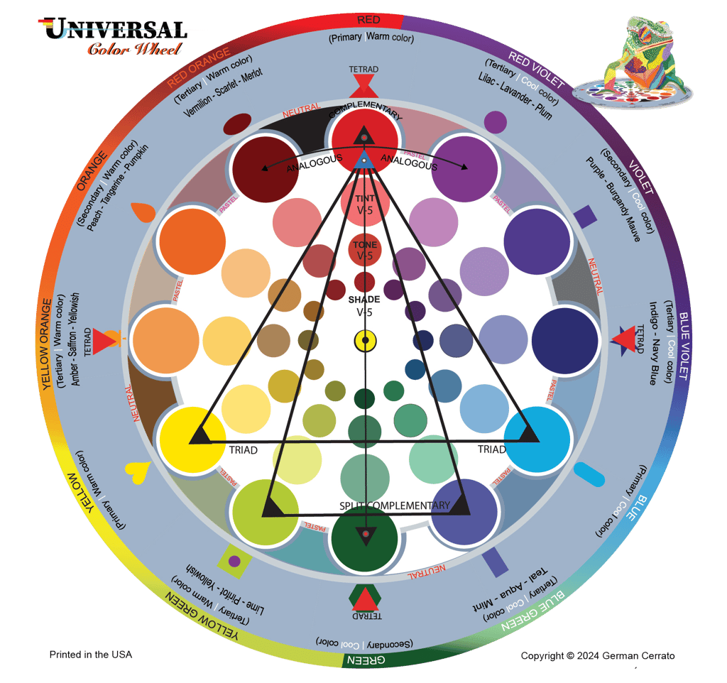
The Universal Color Wheel (6x6 in) consists of two parts: a base that arranges all colors in a circular design, and a transparent overlay that enables users to recognize, isolate, and choose specific colors for the analysis and creation of harmonious color palettes.


As you rotate the transparency clockwise towards cooler hue and choose a color, for example, Violet, you will discover all the corresponding harmonious color combinations for that specific shade.


As you rotate the transparency counterwise towards warmer hue and choose a color, for example, yellow-orange, you will discover all the corresponding harmonious color combinations for that specific shade.


The Universal Color Wheel consists of two element the base and an indicator. The base is the foundation that displays the hues, along with essential information related to the colors.
The indicator is a circular transparency attached to the base made out of clear mylar material that reduces the obstruction of colors while also point to the your selected color alongside their corresponding harmonious color schemes.
How the Universal color wheel function with Color Theory and Its Applications
Color theory is an essential part of art and design. It helps us understand how colors work together, how they affect our emotions, and how they communicate ideas. By combining science, psychology, and creativity, color theory guides us in using color in balanced and meaningful ways.
The Universal Color Wheel
The color wheel is the foundation of color theory, organizing colors in a circular format to show relationships between primary, secondary, and tertiary colors.
The Universal color wheel is a 6x6” comprises of a base and transparency indicator to facilitate easy viewing of selected color or schemes. It actually pack with a lot information as shown:
Primary Colors: Red, Blue, Yellow (Cannot be created by mixing other colors)
Secondary Colors: Green, Orange, Purple (are created by mixing two primary colors)
Tertiary Colors: Red-Orange, Yellow-Orange, Yellow-Green, Blue-Green, Blue-Purple, Red-Purple (are created by mixing primary and secondary colors)
The Universal color wheel is comprised of:Warm Colors: Reds, Oranges, Yellows (Evoke energy, passion, or warmth)
Cool Colors: Blues, Greens, Purples (Evoke calmness, tranquility, or sadness)
Neutral Colors: Greys, Whites, Blacks, and Browns (Often used to balance vibrant colors or create minimalist designs)
Pastel colors
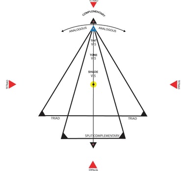
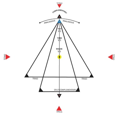
Values of Tint, Tone, and Shades
Harmonious color scheme as; Triad or triadic, Tetrad or tetradic, complementary, split-complementary, analogous, and monochromatic.
Precise and common color names.
Color Harmonious schemes
Harmony refers to visually pleasing combinations of colors. There are several common schemes:
Complementary Colors: Colors opposite each other on the wheel (e.g., blue and orange). These combinations create contrast and dynamic energy.
Analogous Colors: Colors next to each other on the wheel (e.g., green, blue-green, and blue). They create a calming, unified look.
Tetradic Colors: four colors comprising of two set of complementary colors
Triadic Colors: Three colors evenly spaced around the wheel (e.g., red, yellow, blue). This scheme creates balance with high contrast.
Split-Complementary Colors: A base color with two adjacent colors to its complement, offering contrast with less intensity.
Monochromatic Colors: Different shades, tints, and tones of one color for a subtle, elegant effect.
Color Psychology
Colors affect emotions and perceptions, Example:
Red: Passion, energy, urgency
Blue: Trust, calm, professionalism
Green: Nature, health, tranquility
Purple: Royalty, creativity, or mystery.
Yellow: Optimism, happiness, attention-grabbing
Black: Power, elegance, mystery
White: Purity, simplicity, cleanliness
Understanding these emotional associations helps in branding, marketing, artwork and interior design.
Color Applications
Art & Design: Painting, digital art, fashion
Branding & Marketing: Logos, advertisements
Interior Design: Mood creation, space perception
Web Design: User experience, readability
Healthcare: Soothing environments, accessibility for color-deficient individuals
Technology and industries: Color coding, user interface design
Practical Tips when using colors schemes in your artwork or design
Use the 60-30-10 Rule for balanced color compositions and proportion.
Test color combinations under different lighting conditions.
Always consider your audience and cultural color associations uses my charts Historical and restricted colors use in different cultures in my book The meaning and applications of colors in business, graphic, art , and color theory book available in Colortheoryeducation.com and amazon.
Use contrast and saturation levels to improve readability in marketing and visual attraction in art.
Understanding these emotional associations helps in branding, marketing, and interior design.
4. Color Temperature
Colors are also categorized by temperature:
Warm Colors (Red, Orange, Yellow): Energizing and inviting.
Cool Colors (Blue, Green, Purple): Calming and soothing.
5. Contrast and Accessibility
High contrast improves readability and visual impact, essential in web design and branding. Accessibility considerations, such as Color Vision Deficiency (color blindness), ensure inclusivity by using color combinations visible to everybody.
6. Color in Different Fields
Art & Design: Creating mood, balance, and storytelling.
Branding: Establishing brand identity (e.g., Coca-Cola red for excitement).
Fashion: Reflecting trends and personal style.
Interior Design: Influencing atmosphere and spatial perception.
Marketing: Triggering emotional buying decisions.